Professional Adviser: Redesign
Freelance Art Direction (2011)
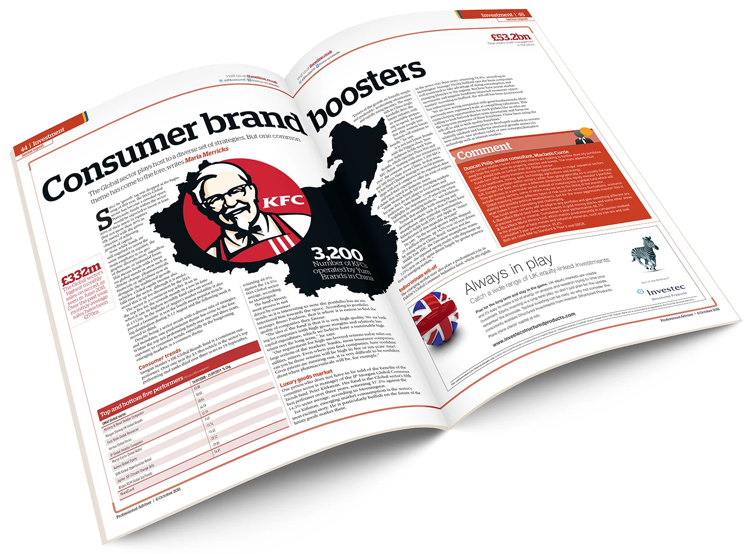
Professional Adviser was looking tired before my redesign in 2011, the client wanted something that the reader would not be 'embarrassed to be seen on the train with'.
Information is king with this kind of title so I imposed strict rules on illustration leading to a more dip-in-dip-out infographic feel. The contemporary slab serif 'Stag' was used liberally in conjunction with DIN and Giovanni to create an approachable yet authoritative new look.
CLICK THE IMAGES BELOW FOR A CLOSER LOOK


